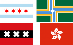
Project 8: Design Seward’s Flag!
Before you start, you need to brainstorm! Here are the basic rules:
Principles of Flag Design:
1. Keep it simple.
It needs to be able to be seen and recognized from far away.
2. Use meaningful symbolism.
This one is important! What does Seward mean to you? How can you describe that visually?
Please look at Seward’s website to read about its history.
*some ideas
Habitat: Mountains and Ocean, Glaciers, Wildlife!
Industries: Fishing, Tourism, Railroad
Big events: Gold Rush encampment, 1925 begining of original Ididarod Trail (Delivering diptheria antioxin to Nome), Benny Benson Designed the Flag, 1964 Earthquake, Mount Marathon Race…
3.Use three to four basic colors – one of these colors should be black or white
4. No lettering or seals.
5. Be distinctive.
Definition:
-
characteristic of one person or thing, and so serving to distinguish it from others:
Basically this means different and unique!
The presenter of the Ted Talk, Roman Mars, has an article about flags which are succesful, yet break the rules of flag design. Check them out for inspiration too! In fact, look at all sorts of flags for inspiration! Here’s a cool site. And this one ranks all the state flags, Alaska is near the top!
Step one: Open a document which is 11 inches wide by 8.5 inches tall. Imporant! Under resolution type 300! That’s so this will be a high quality image when you print it!
Step two: using the rules of flag design posted above, make your flag! Think A LOT!
Reminder—>Put different objects in different layers! This is so you can manipulate and move them!
Reminder—>Do a neat job cutting things out! You can also draw geometric shapes or use simple clip art (ie a star)
Reminder—>Be really thoughtful about the colors and objects you choose to use, you will need to defend these decisions!
When you are finished, post this under project 8. Include a paragraph where you explain the meaning of everything on your flag! Have fun!
 Comments(0)