February, 2016

Project 10: Perspective Scene

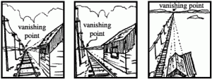
Perspective is an approximate representation on a flat surface of an image as it is seen by the eye. Objects appear to grow smaller as they get further away.  Here is an example:

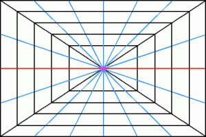
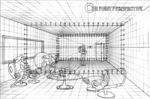
The different parts of one point persepctive:

Horizon Line is the eye level of the observer vertically.

In this graphic, the horizon line is represented in red.

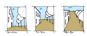
In this illustration, the horizon line is where the blue sky meets the brown street.

Perhaps in the left hand drawing the viewer is sitting on the sidewalk, so the horizon line is low.  In the right hand drawing the viewer is standing on the roof of a building, therefor the horizon line is higher.

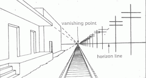
The Vanishing Point is a point at which receding parallel lines seem to meet when represented in linear perspective .

The Vanishing Point rests on the horizon line and it represents where the viewer is situated from left to right.

In the central panel of this illustration of a railroad, the viewer is to the left of the tracks, therefore the vanishing point is on the left side of the horizon line.

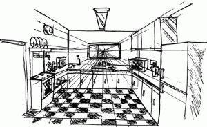
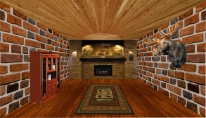
An interior scene also has a horizon line and vanishing point.  Can you find them in this drawing?

Your assignment is to create an interior scene which follows linear perspective.

Your scene must have:

A floor

A ceiling

walls

at least one object on each wall which follows perspective

(window, book case, door…)

at least one figure, standing, jumping, or floating which looks convincing in the scene.

Have fun!

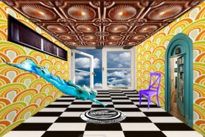
Here is my example:

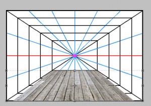
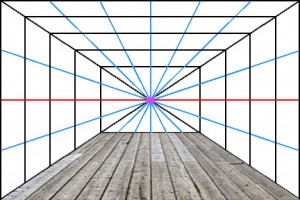
Begin with a grid or a photo that you can use as a guide for your perspective lines and wall shapes.  I used this one:

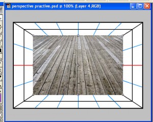
Here is how I made a hardwood floor follow perspective.

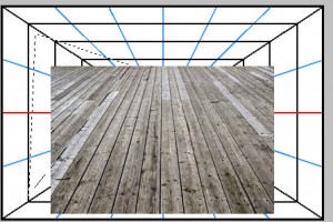
1. I found a picture that already had some perspective lines and added it as a new layer onto my grid

2. Using the polygonal lasso tool , isolate the corners of the hard wood floor.

3. Delete both corners

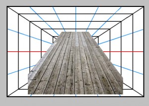
4. Line up the top of the floor with the bottom of the back wall

5. Using Edit–>Transform–>Perspective or Edit–>Transform–>Skew to make the floor fit perfectly.

6. Repeat this process or a similar one for the walls, ceiling, and objects along these planes.

Here are some examples form the Past!

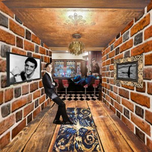
sorenperpective

Soren Fejes

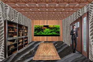
damnyanperspective

Damnyan Letter

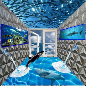
jonahperspective

Jonah DeBoard

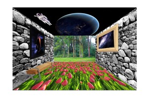
saraperspective

Sara Tolson

jessicaperpective

Jessica Degnan

thomasperspective

Thomas Zweifel


Project 9: Mandala

What is a mandala?

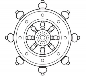
A mandala is a geometric pattern or chart, typically circular or square, that symbolically represents the cosmos and is used for meditation purposes. The mandala originated in the Hindu religion, in which it was first used as a design element in temples, and was borrowed into Buddhism. Other religions and cultures have analogous meditation aids, and in an expanded sense, a mandala may even be a round, symmetrical building used for worship.

Creating a mandala can be a form of meditation, as well as contemplating a finished mandala. In Tibetan Buddhism, there are strict guidelines concerning the content and design of a mandala, including the visualization of the piece and mantras to be recited as it is made. Different types of mandalas are used to represent different elements of Buddhist beliefs and cosmology, but they are generally full of symbolism and richly detailed.

Tibetan Buddhists also make sand mandalas, using delicate tools and colored sand to create intricate designs. After they are made and contemplated according to ceremony, sand mandalas are destroyed, symbolizing the impermanence of everything. Every element of the sand mandala, from marking out the pattern, to pouring the sand, to disposing of the used sand, is ritualized. Mandalas also appear in Japanese Buddhist temples and rituals, although the sand mandala is unique to Tibetan Vajrayana or Tantric Buddhism. Meditation or prayer aids in other religious traditions, such as the rosary of Catholicism, are considered by some to be a type of mandala. (from WiseGEEK.com)

We are going to make our own mandalas using photos.

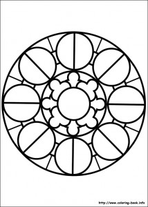
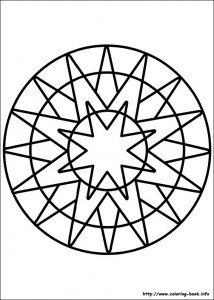
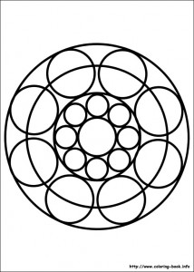
1. Choose a mandala template.

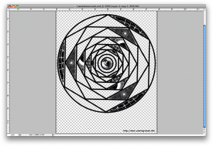
2. Open the template in Photoshop and delete the white so that it’s transparent other than the black lines.

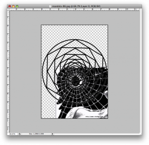
3. Add your first photo as another layer and put it behind the mandala template.  Choose your photos based on texture and color.

4. Pick one shape within the mandala template to focus on.  Move the photo layer until you like the section which is behind your mandala shape.  You can rotate it or adjust the scale if you’d like.

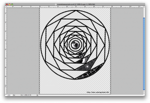
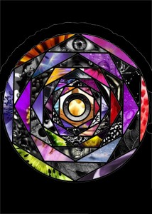
5. On the mandala template layer, use the magic wand tool to select inside the shape.  Click Inverse Selection.  Go to the photo layer and press delete.  You should now have just a portion of the photo inside the mandala shape, like the photo below.

6. Continue this process until you have a vertical row filled.

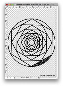
7. Unclick the eyeballs on all of the layers except the new shape layers you have made.  Click Layers->Merge Visible. Now all of your shapes are on one layer.

8. Duplicate this layer and rotate it to fit other sections in a pattern.

9. Continue with this process until the whole mandala is filled!  My only rule is that shapes from the same photo should not touch.  If you want, at the end, get rid of the mandala template layer and add a new background color.  Have fun, be creative and make something that looks cool!

10.  When you are done, post it to your blog under Project 9:Mandala, and write about how the project went, if you learned anything,etc.

Here are some past examples from SHS students:

Audra Atwood

Michael Marshall

Project 8: Design Seward’s Flag!

Good Flags

Before you start, you need to brainstorm!  Here are the basic rules:

Principles of Flag Design:

1. Keep it simple.

It needs to be able to be seen and recognized from far away.

2. Use meaningful symbolism.

This one is important!  What does Seward mean to you?  How can you describe that visually?

Please look at Seward’s website to read about its history.

*some ideas

Habitat: Mountains and Ocean, Glaciers, Wildlife!

Industries: Fishing, Tourism, Railroad

Big events: Gold Rush encampment, 1925 begining of original Ididarod Trail (Delivering diptheria antioxin to Nome), Benny Benson Designed the Flag, 1964 Earthquake, Mount Marathon Race…

3.Use three to four basic colors – one of these colors should be black or white

4. No lettering or seals.

5. Be distinctive.

Definition:

  1. characteristic of one person or thing, and so serving to distinguish it from others:

    Basically this means different and unique!

The presenter of the Ted Talk, Roman Mars, has an article about flags which are succesful, yet break the rules of flag design.  Check them out for inspiration too!  In fact, look at all sorts of flags for inspiration!  Here’s a cool site.  And this one ranks all the state flags, Alaska is near the top!

Step one: Open a document which is 11 inches wide by 8.5 inches tall.  Imporant!  Under resolution type 300!  That’s so this will be a high quality image when you print it!

Step two: using the rules of flag design posted above, make your flag!  Think A LOT!

Reminder—>Put different objects in different layers!  This is so you can manipulate and move them!

Reminder—>Do a neat job cutting things out! You can also draw geometric shapes or use simple clip art (ie a star)

Reminder—>Be really thoughtful about the colors and objects you choose to use, you will need to defend these decisions!


When you are finished, post this under project 8.  Include a paragraph where you explain the meaning of everything on your flag!  Have fun!

Assignment 10: Flag Practice 2

1. Open a new document 6″ wide x 4″ tall.

2. Using the paintbucket tool, flood the background layer a color of your choice.

3. On a new layer, using the rectangular marquee tool draw a verticle stripe and fill it with the color of your choice.

stripe

4. Duplicate the stripe layer and rotate it 90 degrees.  Move it so it crosses the first stripe in a way that you like.

2stripes

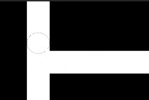
5. In a new layer, draw a circle with the eliptical marquee tool so that it fits exacly inside the width of a stripe.  Do this by clicking right on the edge of the stripe as you draw.  Hold shift as you draw for a perfect circle.  Fill it with a different color than your stripes!

circlee

6. Move your circle so that it rests agains the outer edges of both stripes.  If it doesn’t quite fit, change the size with Edit-> Transform.

reddot

7. Erase the ends of the stripes that poke out past the circle

curve w dot

8. Change the color of your circle to match your stripes.  PHEW!  You made a curve!

curve

9. Merge the stripe and circle layers into one. Duplicate this curve at least once!  Change how the two curves are arranged, this is up to you! You could even make them different sizes/rotate them, overlap them, etc.  I changed the color on one!

2 curves

10. Draw a circle with the Eliptical  Marquee Tool while holding shift.  Fill it with the color of your choice.

circlecurves

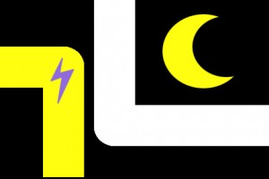
11. Draw a smaller circle with the eliptical marquee tool on the same layer.  Backspace!  You should have a crecent now!  If you want you could make a bullseye type ring instead by erasing the center of your circle out instead of the side.

crecent

12. Click View->Show->Grid.  A grid will appear on your document.  This can help you with symetry!  Use the paintbrush tool to draw a shape with straight edges.  Make the brush 2 pixels wide with a hard edge.  Pick a color you want.  Click and hold shift, then click again and a straight line will be drawn.  Fill this shape with the same color once you are done.  To do this I clicked the majic want outside of my lightning bolt, then selected the inverse, then just filled it!

lightning

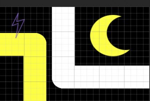
13.  Since things are in seperate layers, feel free to move them around or change the colors.  You are done with Flag Practice Two!  Post it!

flag2


Assignment 9: Flag design Practice 1

Watch the video on the top of the link so that you get the idea of the next project we will be doing!  The next two assignments will be developing skills for the next project (designing a flag for Seward!)

1. Open a new document 6″ wide x 4″ tall.

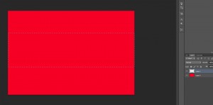
2. Using the paintbucket tool, flood the background layer red.

3. Create a new layer on top of the back ground layer.  Using the rectangular marquee tool draw a big stripe that fills the middle of your document on this layer.

rec marqee2

4. Fill the rectangular selection with white, now you have a big stripe!

2

5. On a new layer, use the Eliptical Marquee Tool to draw a circle.  If you want it perfectly round, hold Shift while you draw it.  Fill if with the color of your choice.

circle

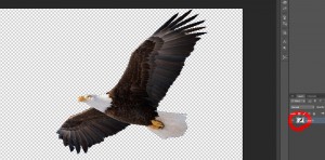
6. Pick an animal or object that you associate with Seward. Find a photo of this animal (not clipart).  Cut out the animal perfectly! I chose this eagle photo:

eagle-soaring

7. Once you have your object/animal cut out as perfectly as possible, hold Ctrl as you click on the box next to the layer (see red circle). This will select your object/animal  perfectly.

click box

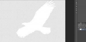
7. Fill your object/animal with a color of your choice.  I chose white.  Now you have a flat silhouette of you object/animal.

sil

8. Put this silhouette onto your Flag!  Arrange things in an appealing way!  Use the move tool to move objects.  Remember you can go to Edit, Transform to change the size, rotate, etc on different layers.  Save as a jpeg!  You have completed the first part of this assignment 🙂

fllag


Project 7: Scream Yo Opinion

By the way, you guys are doing great work, I’m impressed…

The new Project:

First of all, pick an issue.  What do you feel passionately about?  What makes you mad?  Here is a list of controversial issues, what side do you stand on?  For my issue, I chose health care.  I feel that it is way to expensive and that everyone deserves medical help if they are sick.

Your challenge is, how do you convey your message without using words? I want you use symbols.  Symbols are all around us, and we understand what they mean.  Do you understand the messages of the symbols below?

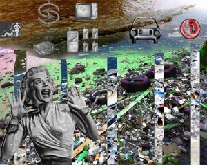
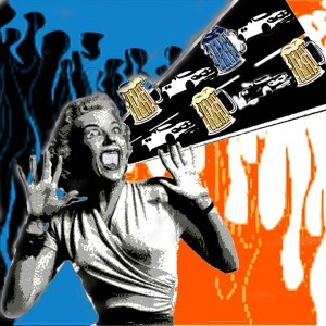
1. Find a photo of a person who is screaming and erase the background.  I found this girl.

2. Delete the background, and put your screamer in a document where the dimentions add up to about 10 inches, you pick the shape.

3.  Find the symbols to convey your opinion, and arrange them so they seem to be coming out of your screamers mouth.  I chose medical symbols and dollar signs.  You have to be creative in this part, but make your message clear.

4.  Stylize your design in two other ways, and make a Snapshot of each version by right-clicking on the corresponding layer and selecting “New Snapshot.”  You are becoming more familiar with Photoshop, so you decide how to change the image, make it look cool!  Suggestions are: Desaturate, Posterize and change colors; Invert; Threshold; Hue/Saturation; and any of the Filters.

5. History Brush! Chose one of your snapshots to use as your base, and with the history brush draw lines to accent your piece.  Think Scream lines.  Remember, if your not happy with how your lines turn out, you can always click CTRL Z (undo).

6.  Create your own brush with a symbol that has to do with your cause.  Delete the background before you select the image to make it a brush.  You might have to resize it.  I chose a stethoscope.  Use your new brush as a history brush as a part of your design.

10.  Post it to your blog under Project 7 and write a little something about the experience of creating it.

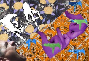
Examples from the past

Assignment 8: The History Brush

Find a photo from the internet with a detailed background.

1. Invert the image by holding CTRL I

2. If your History Palette isn’t already out, click Window->History and it should appear.  You probably recognize it from when we are undoing mistakes!

3.Make a Snapshot of your current inverted image by clicking on the little image of a camera on the bottom of the History Palette.  It is next to the little trash can.

3. Change your inverted image back to its original state by choosing Edit -> Step Backwards.

4. Adjust the Hue/Saturation of your image.  Make a Snapshot of this adjustment too.

5. Change your saturated image back to its original state by choosing Edit -> Step Backwards

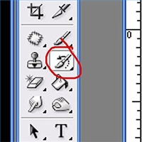
6. Select the History brush on your toolbar. With the brush active, go back to your History palette and click on the tiny box just to the left of the Inverted  Snapshot you made earlier. The thumbnail will show the inverted image. A tiny replica of the History Brush will appear in the box. Now, you’re ready to have some fun…

7. Paint over your image to reveal the inverted image under your brush strokes. Vary the effect by adjusting the Opacity and Flow mode settings at the top of the screen as well as your brush size.

8. Change your brush to the Saturated snapshot. Continue painting on the original photo.  Try to make it look cool!  Be detailed!

9. Create your own brush to decorate your photo with.  To begin, either draw a shape in a new document or layer, or open a photo of a new silouette that you want to use as a brush.  Select this shape.  With your brush shape selected, click Edit -> Define Brush Preset.  Use it as an art history brush!

10. Post your image onto your blog under Assignment 9: History Brush Tool.  Write about using this tool, as well as creating your own brush.